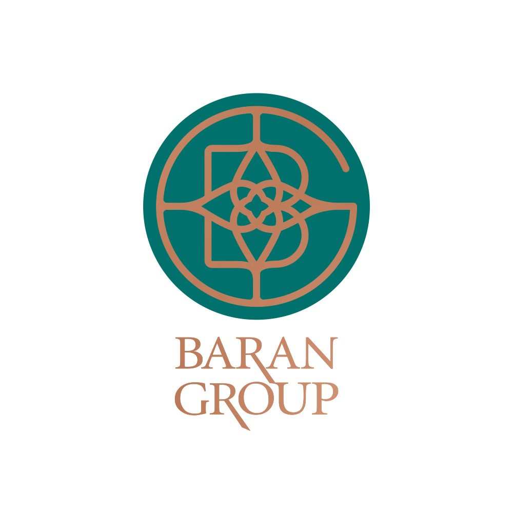
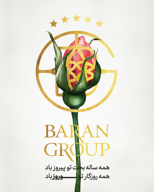
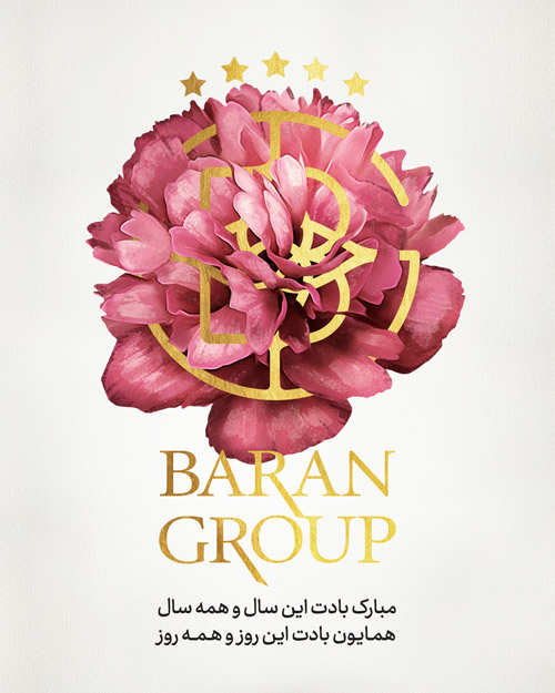
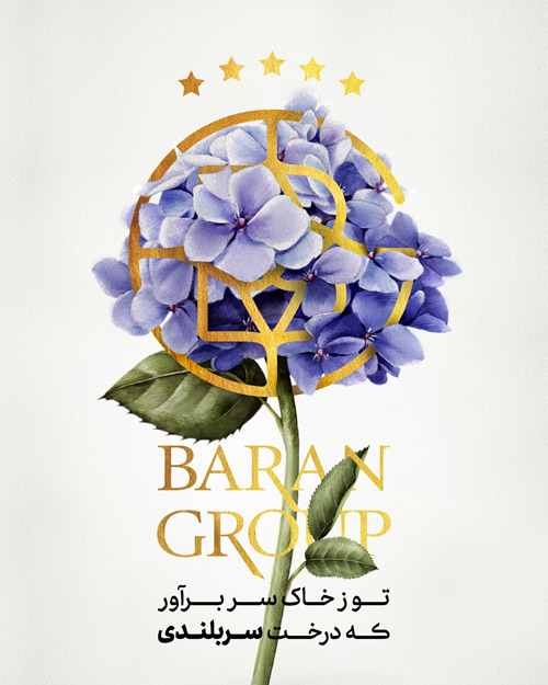
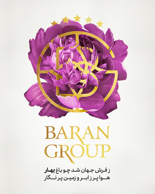
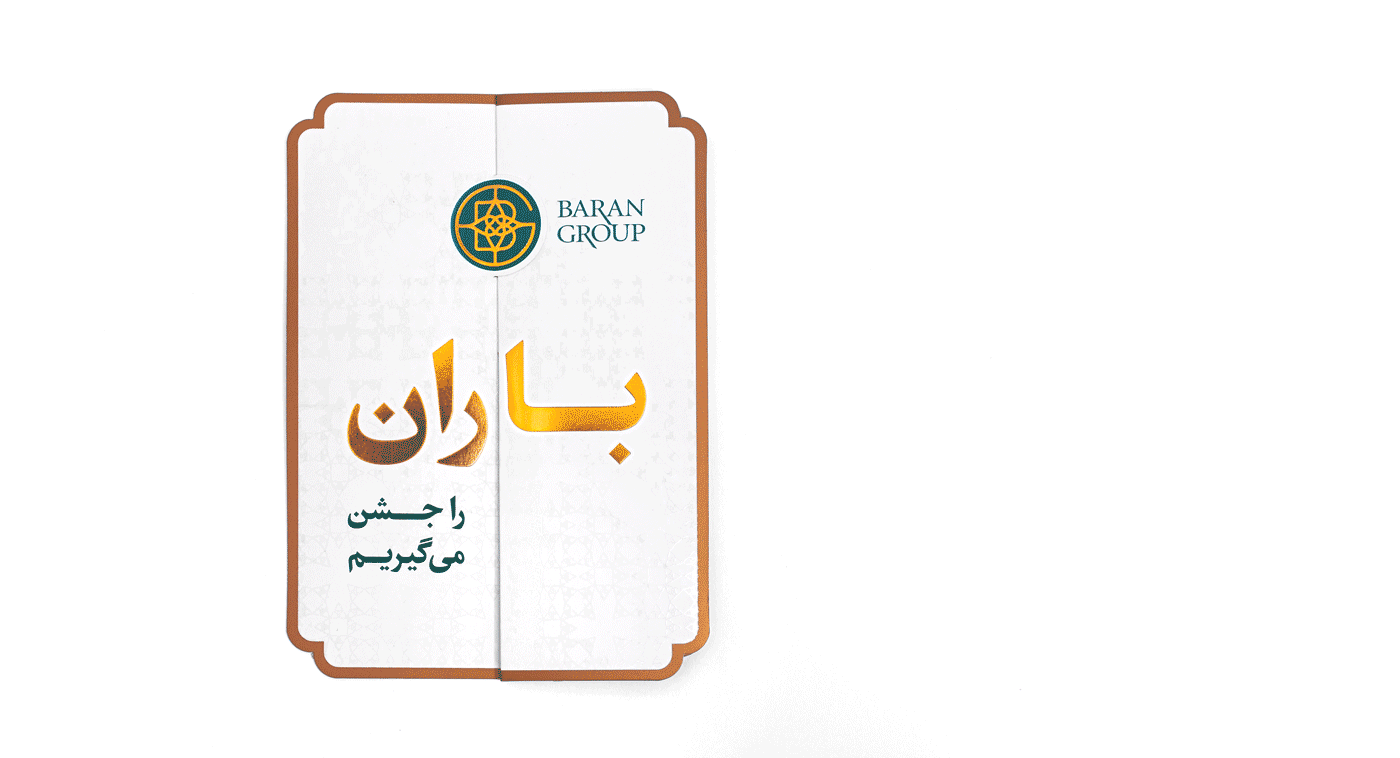
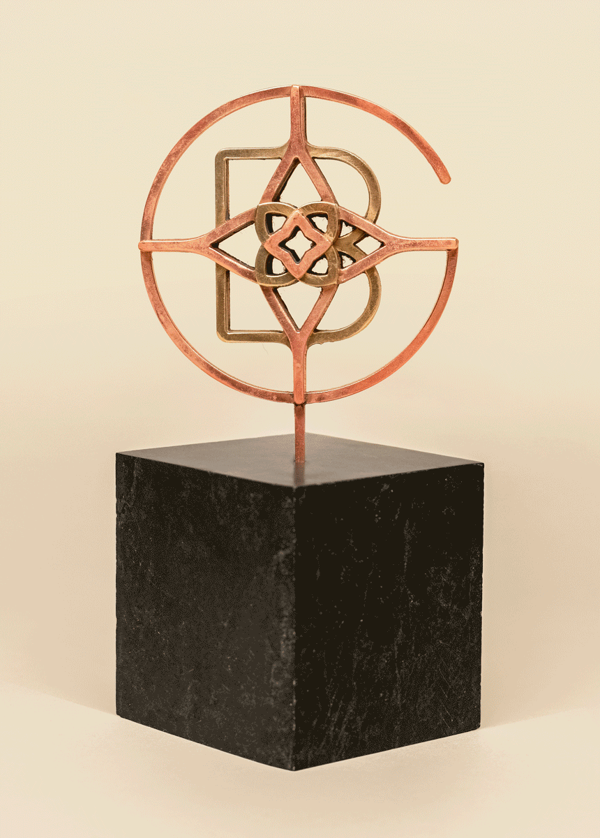
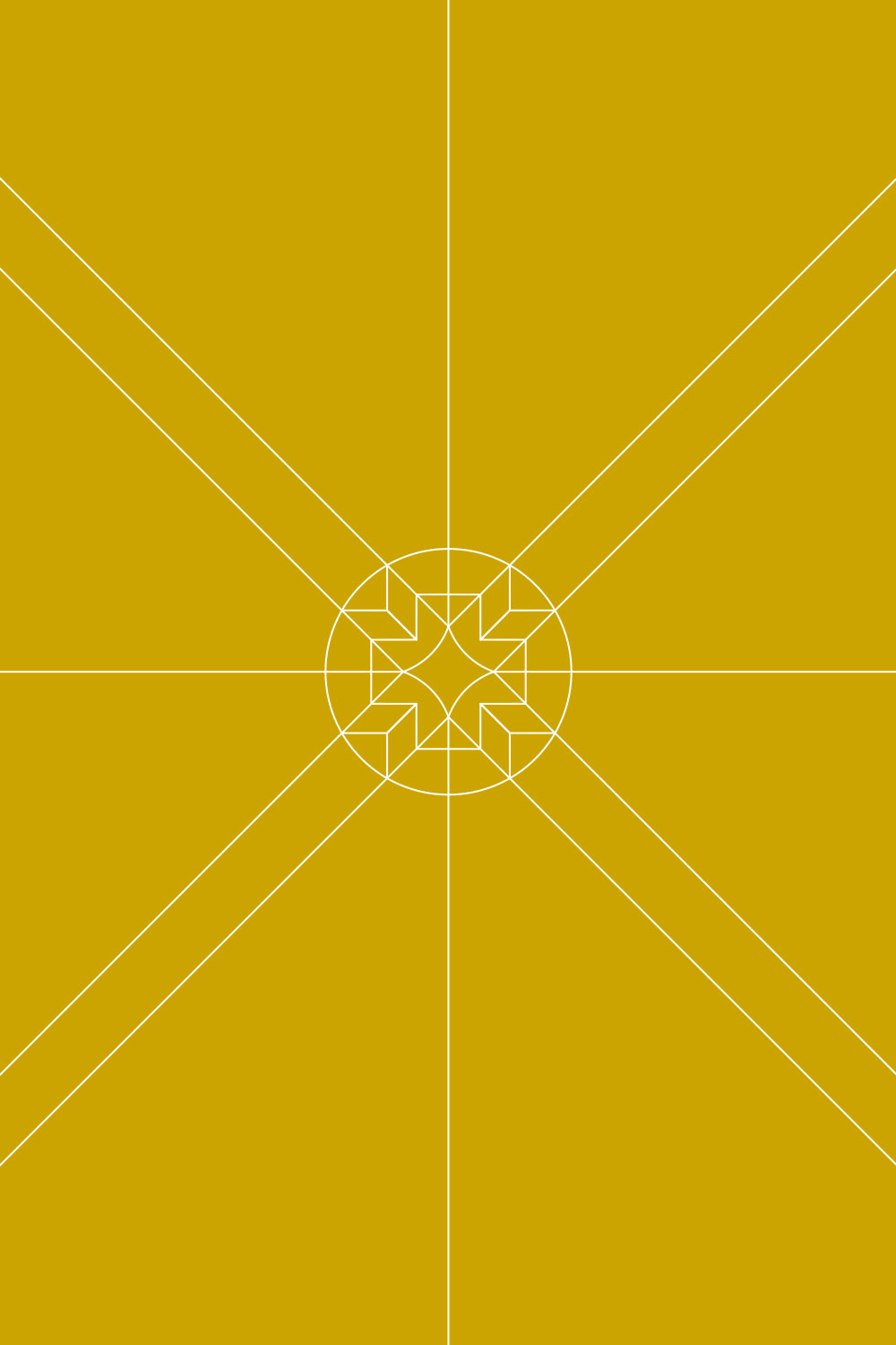
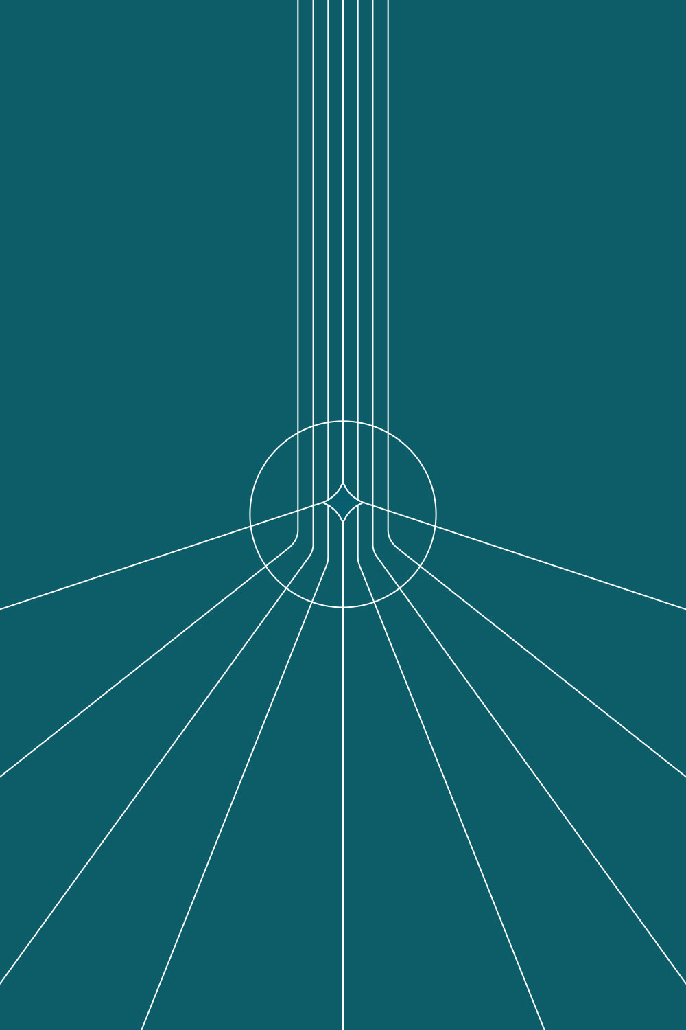
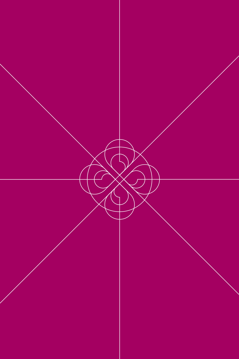
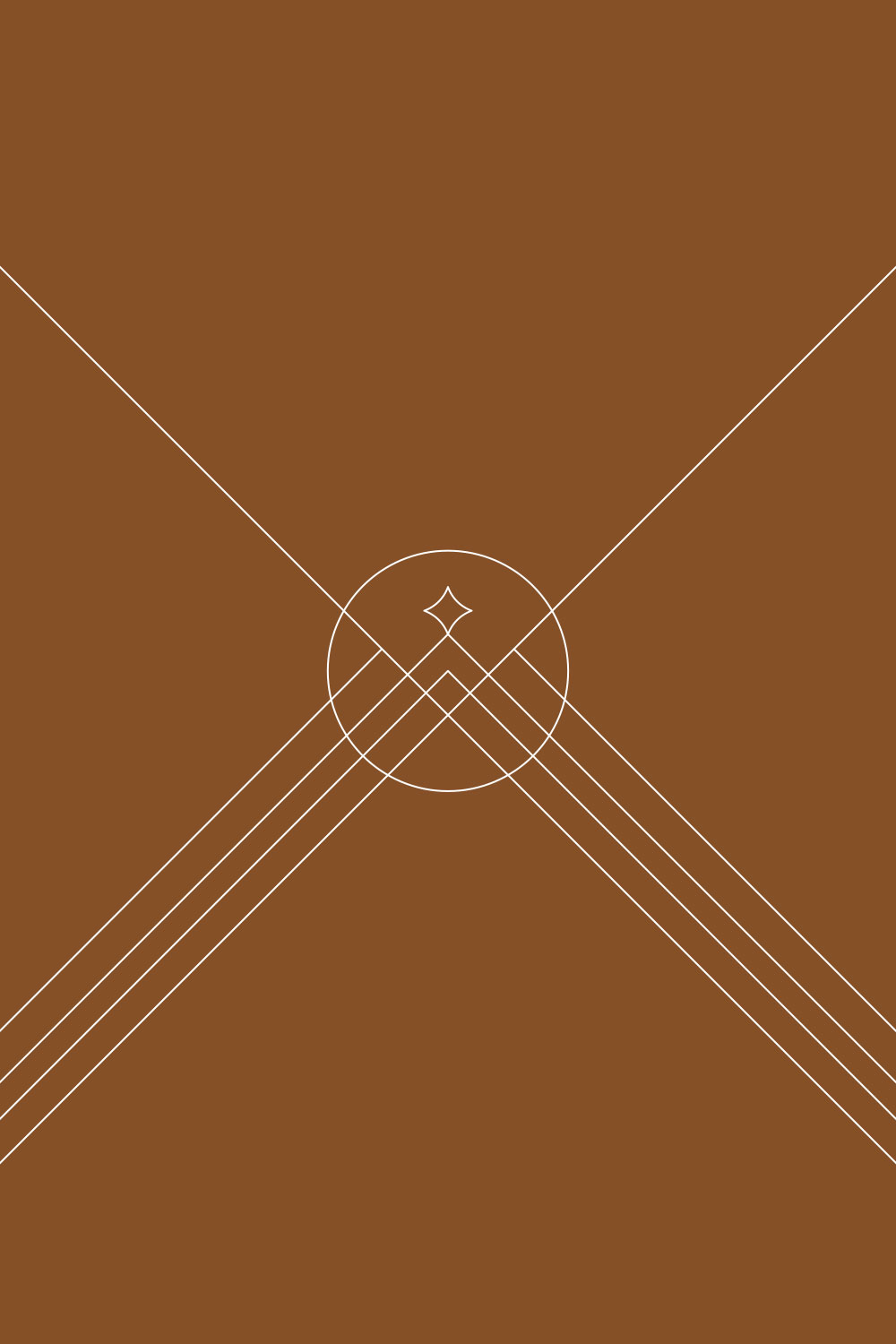
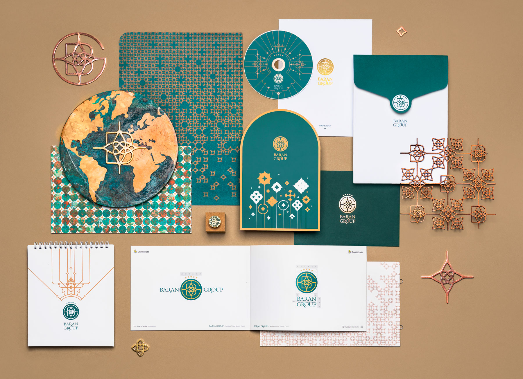
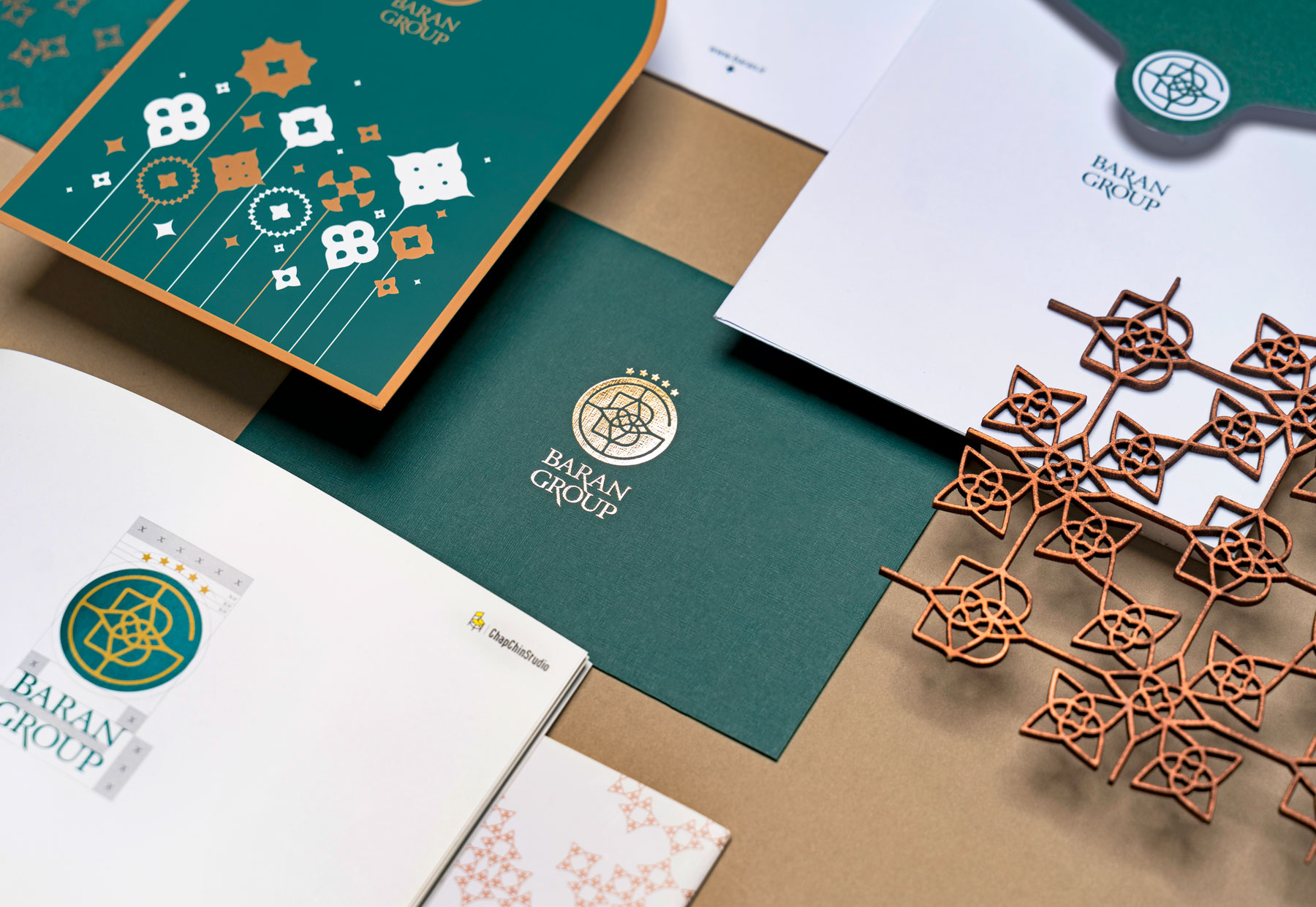
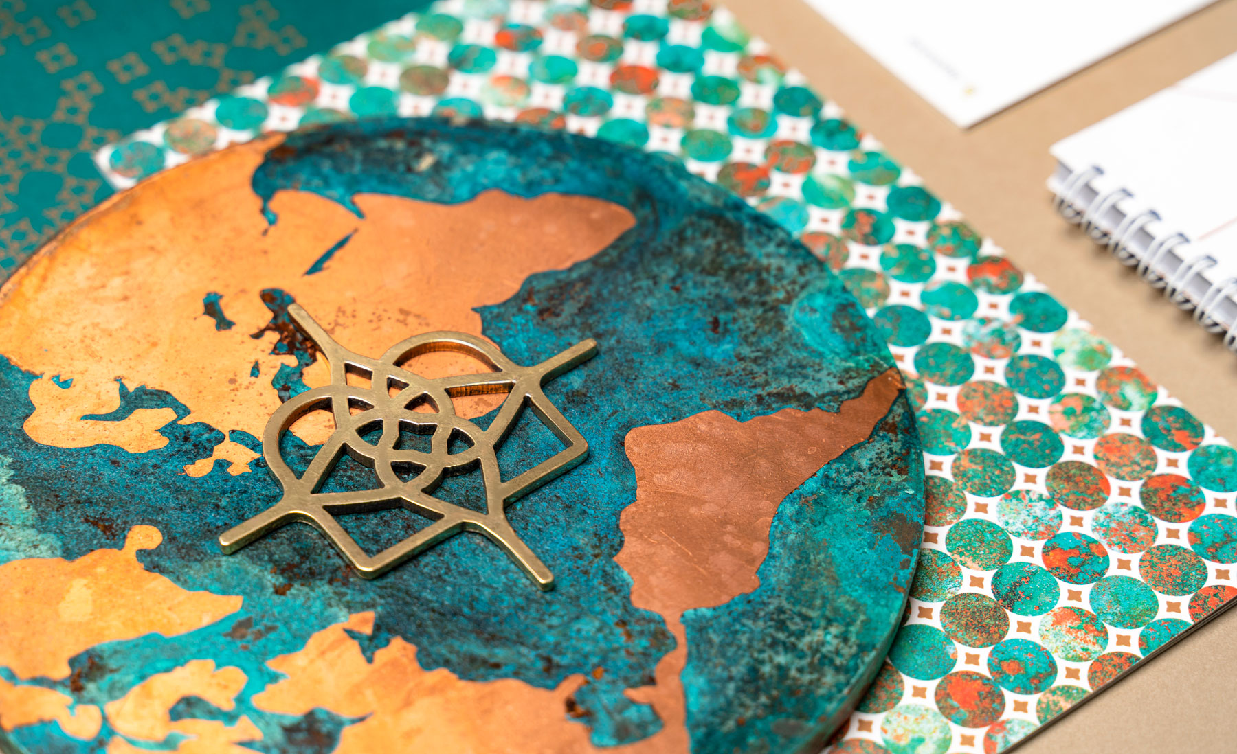
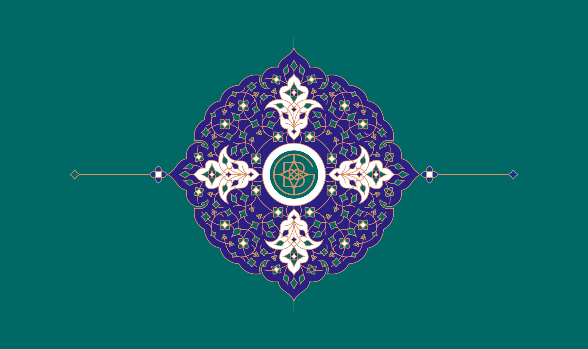
Baran Group is a building company in Mashhad. They also provide luxurious hoteling services for the residents of their apartments. They have been using an old fashioned logo for over ten years. However, as we were about to redesign their visual identity, we had to keep the overall mood of Baran’s previous image in our design. So we worked on the B and G letters in order to design a more compact logo. We also decided to use an equal width for our line drawings to give a modern look to the logo.
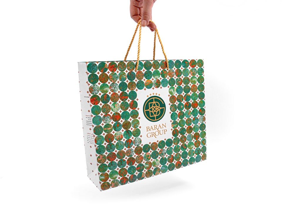
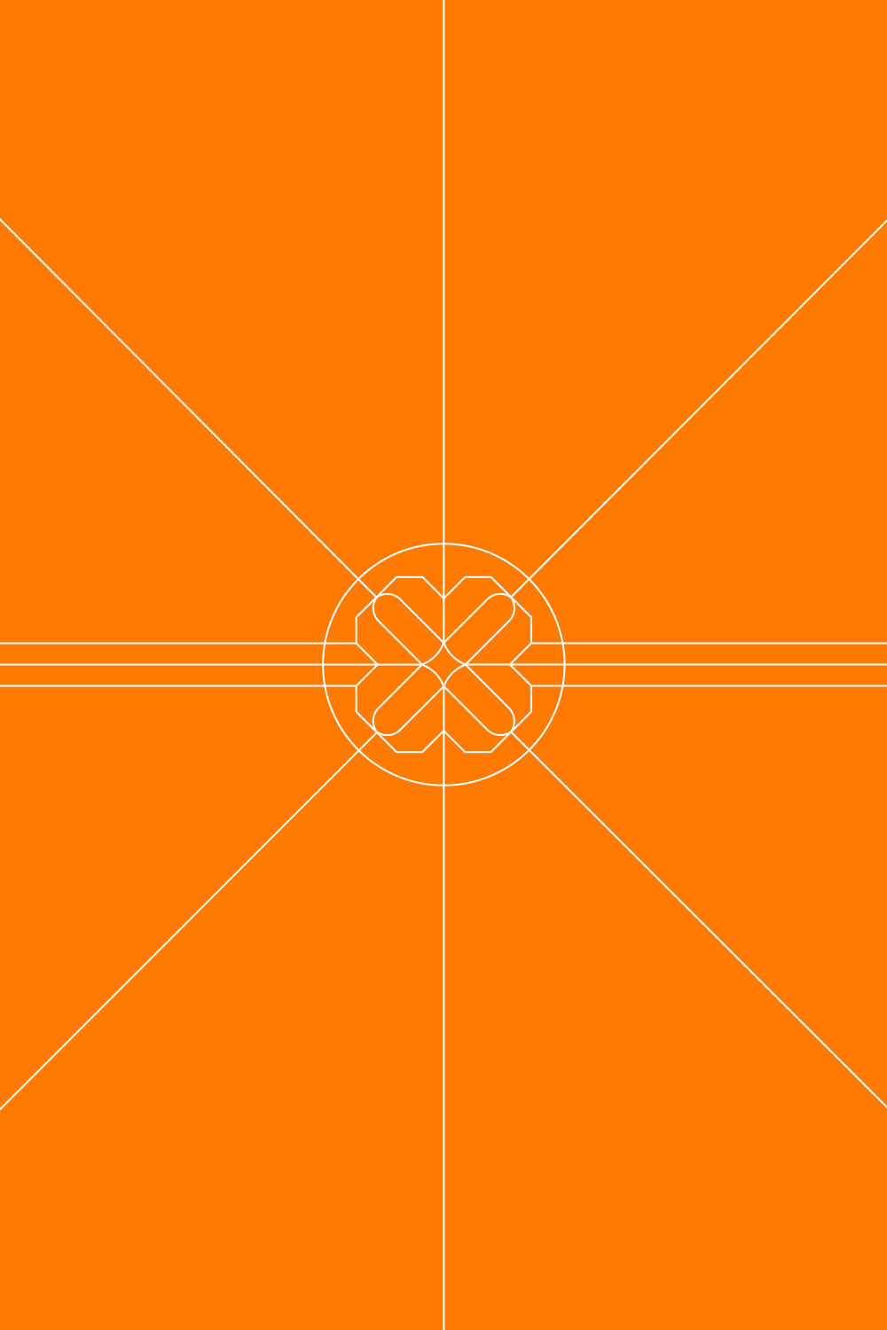
The final result turned into an ornamental round motif that suited the needs of Baran Groups’ byneeds by representing themselves as a luxurious brand.
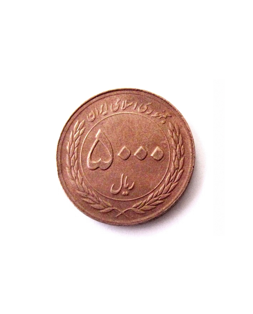
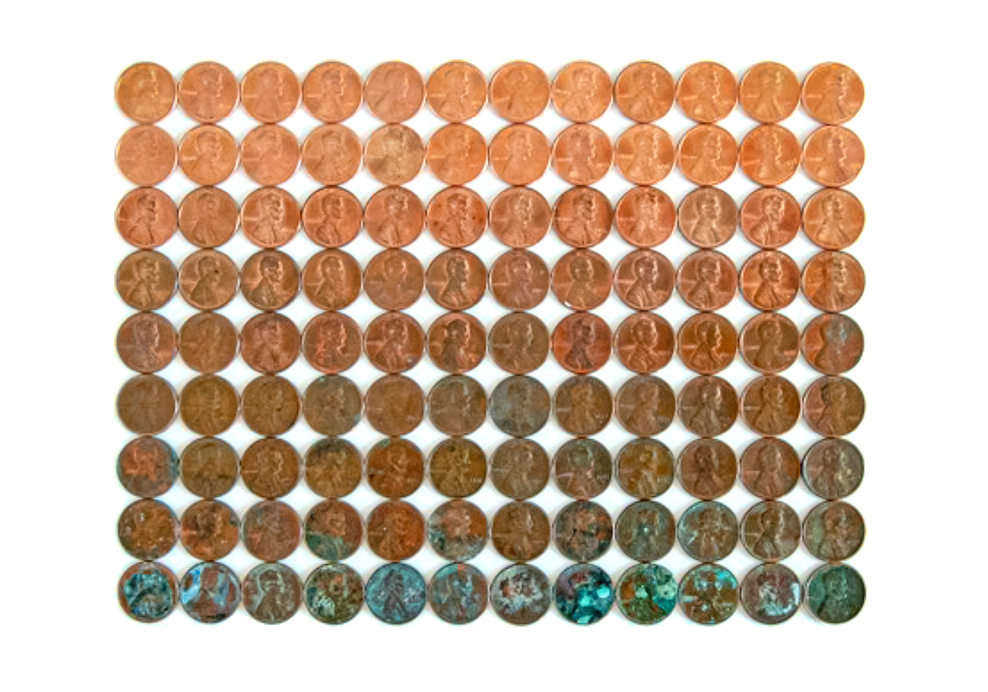
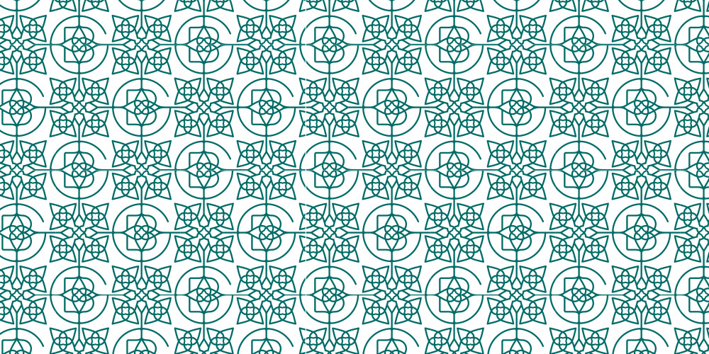
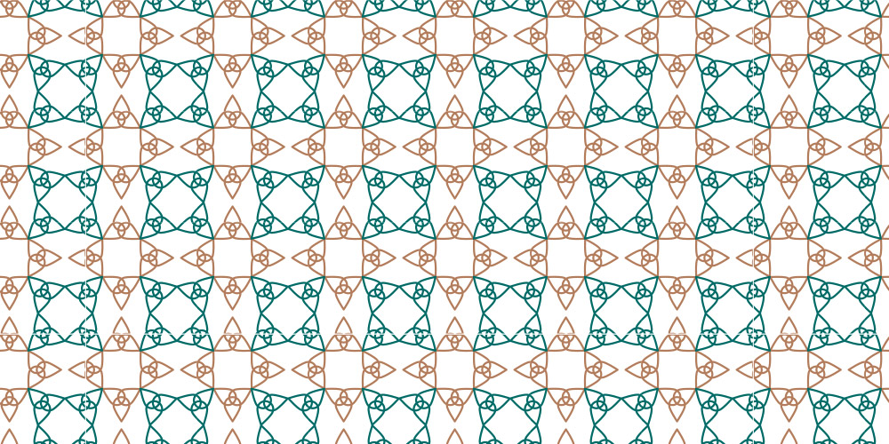
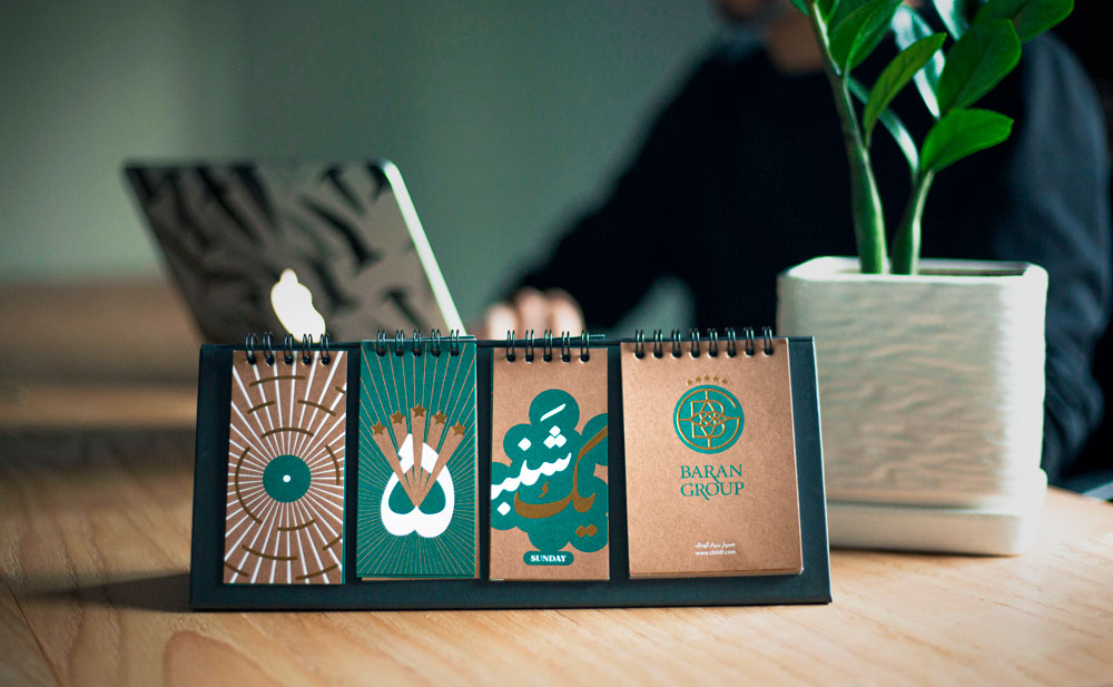
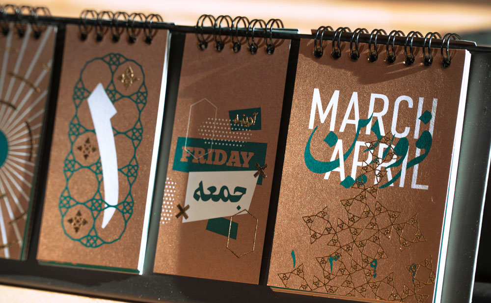
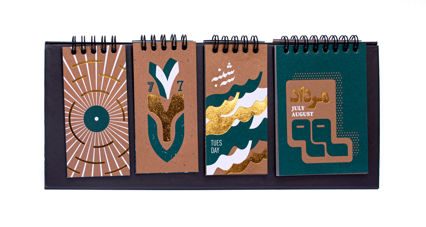
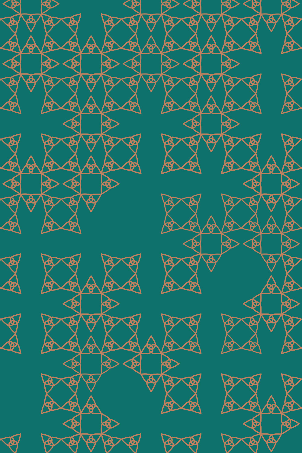
For their colour identity, we found the copper coin very interesting to be used as the primary colour and dark verdigris (green pigment obtained through acetic acid to copper plates) as the second colour. The combination of the two colours produces a lot of creative spaces for us through the development of Baran Groups’ visual identity.
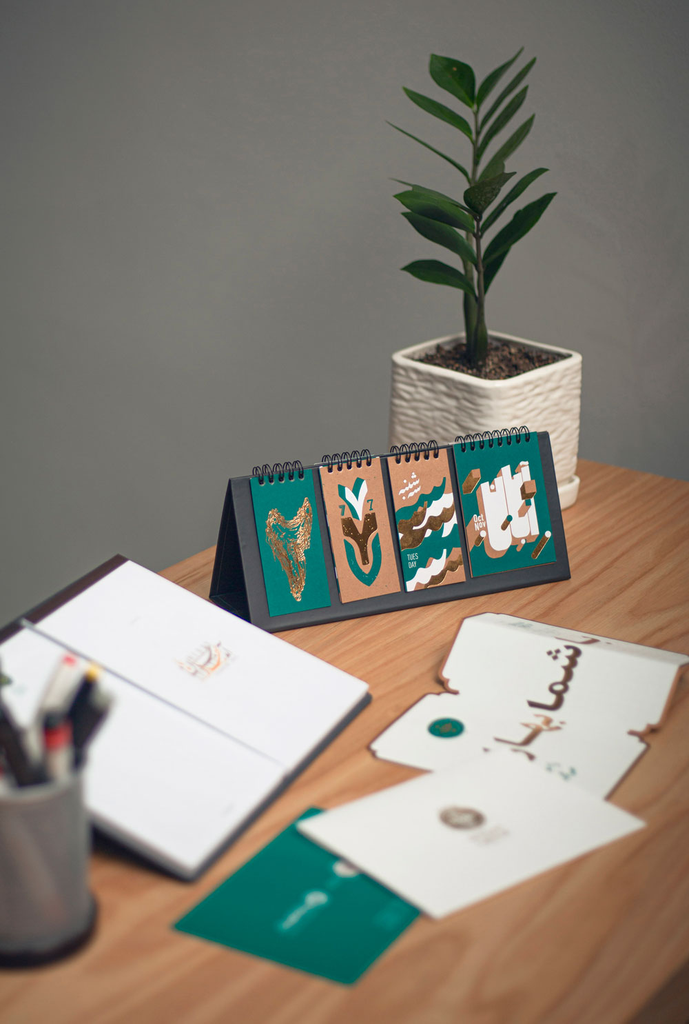
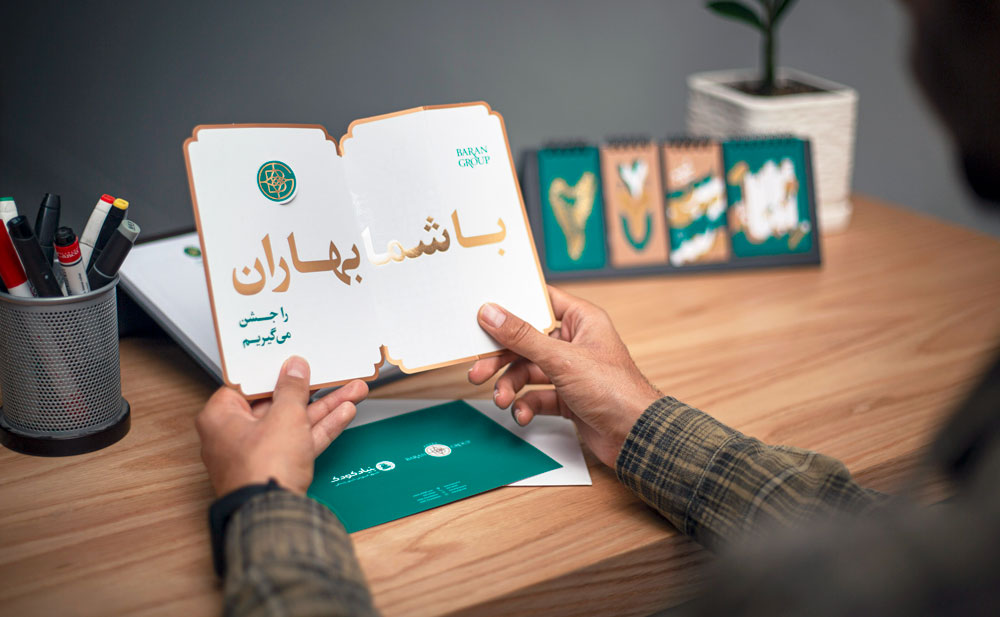
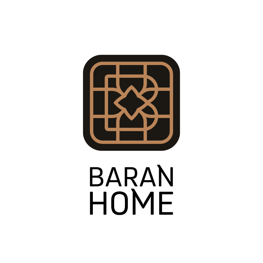
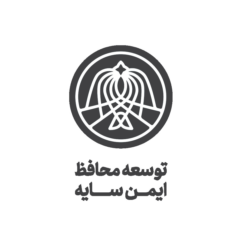
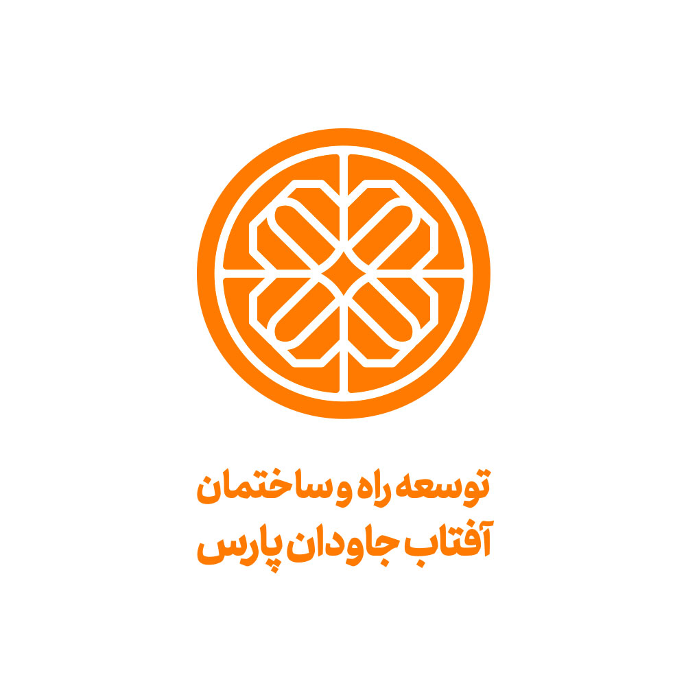
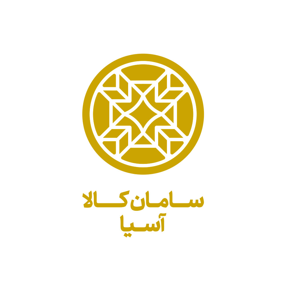
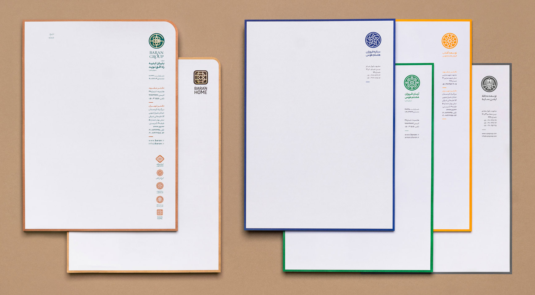
Logo design for subsidiary companies
Client: Baran Group
Design: Davood Morgan, Javad Zarinia, Farid Yahaghi