France Confectionery
Visual Identity | 2020

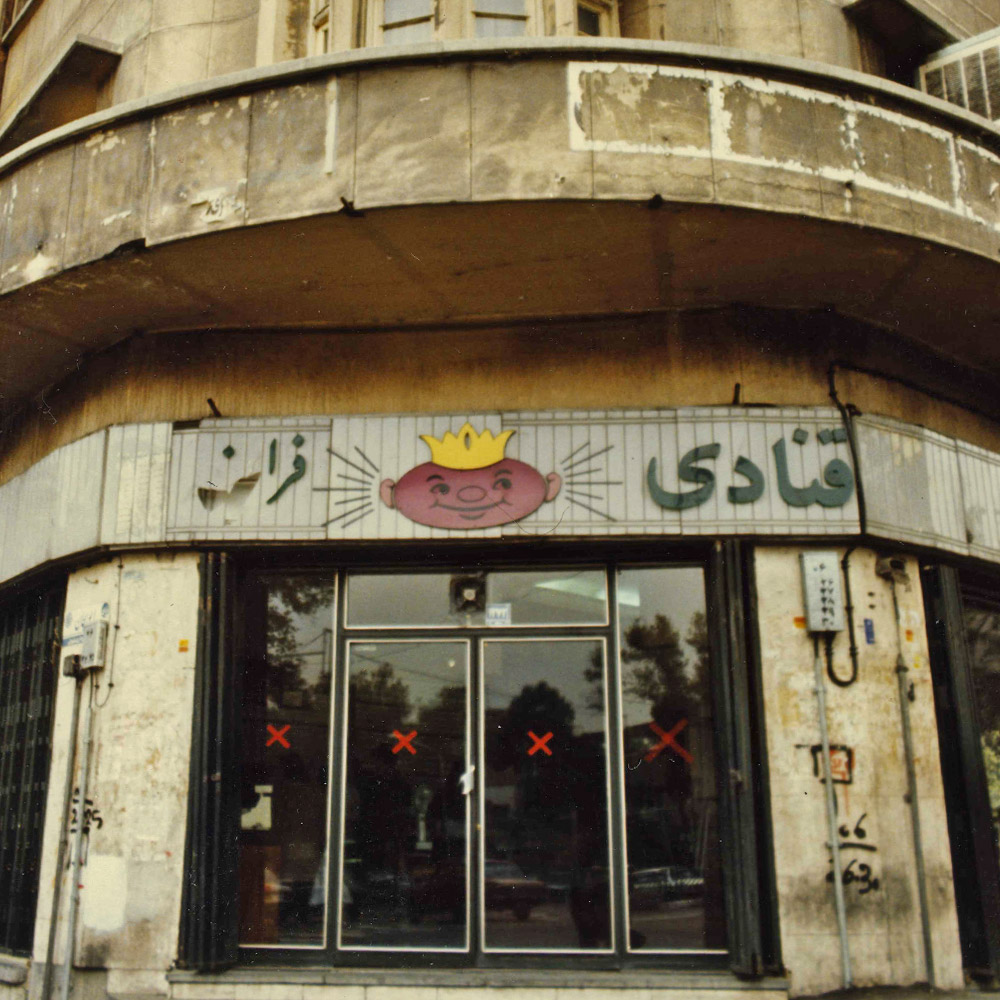
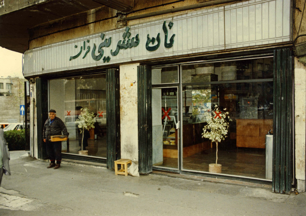
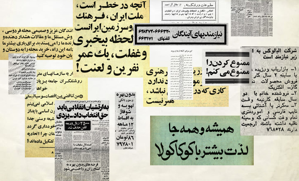
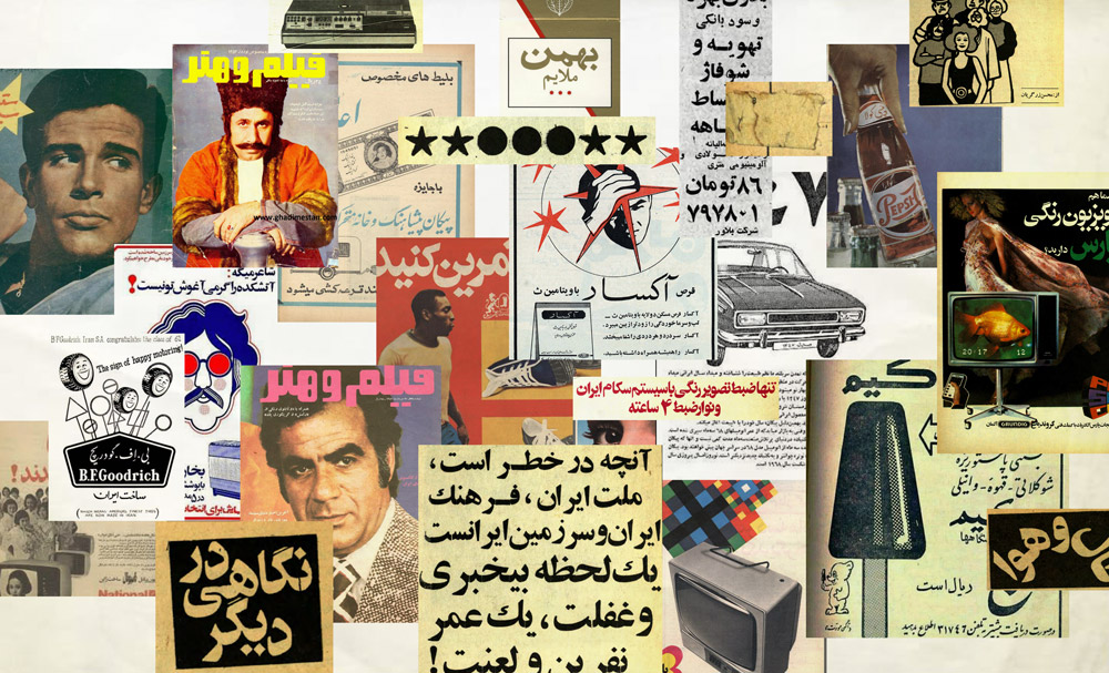
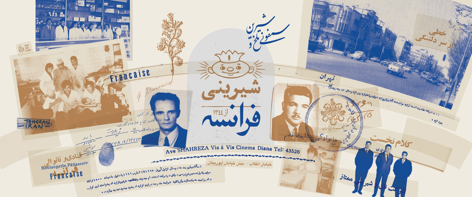
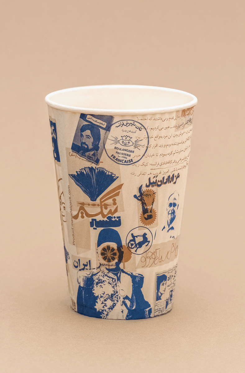
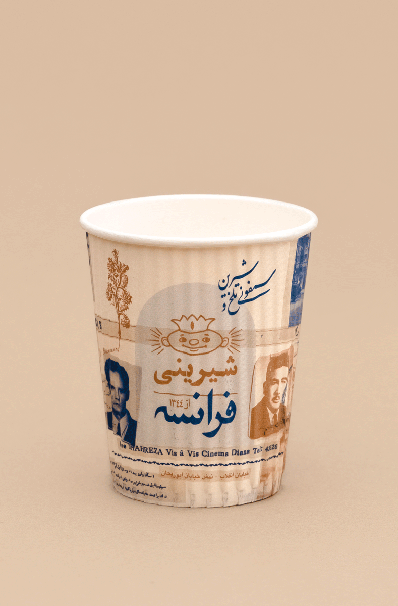
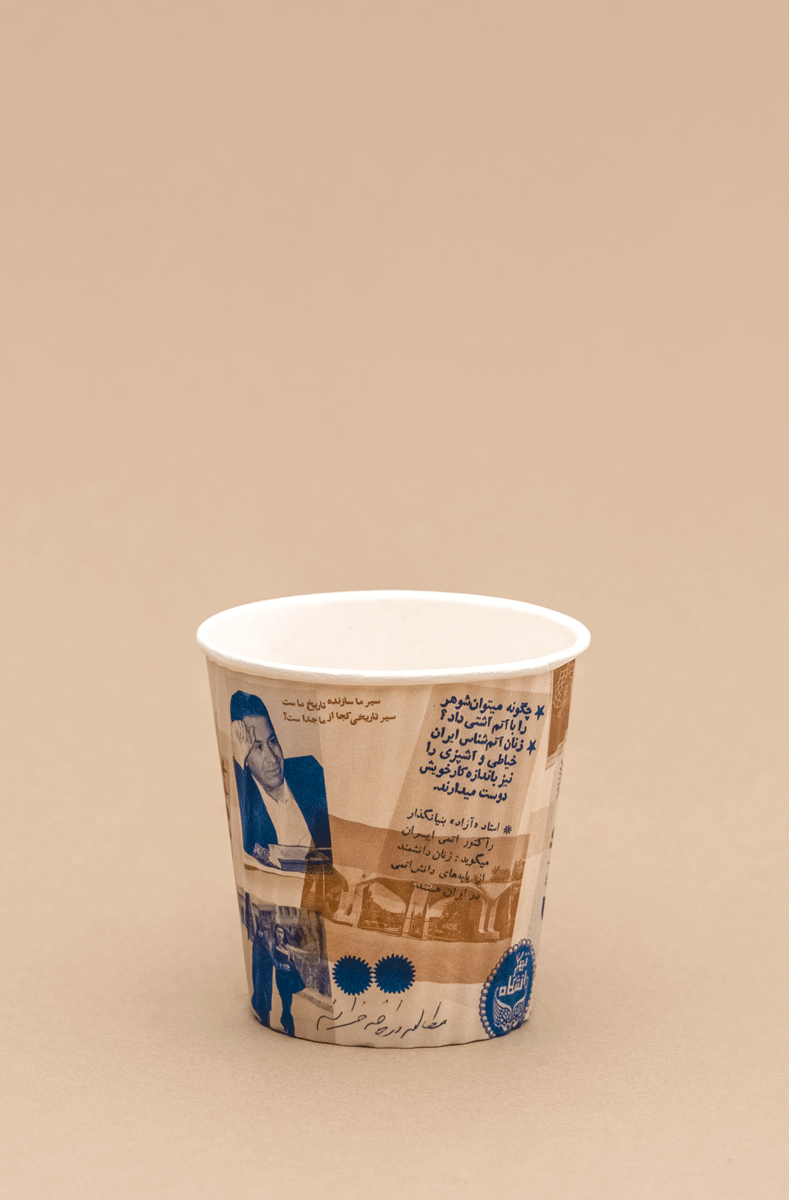
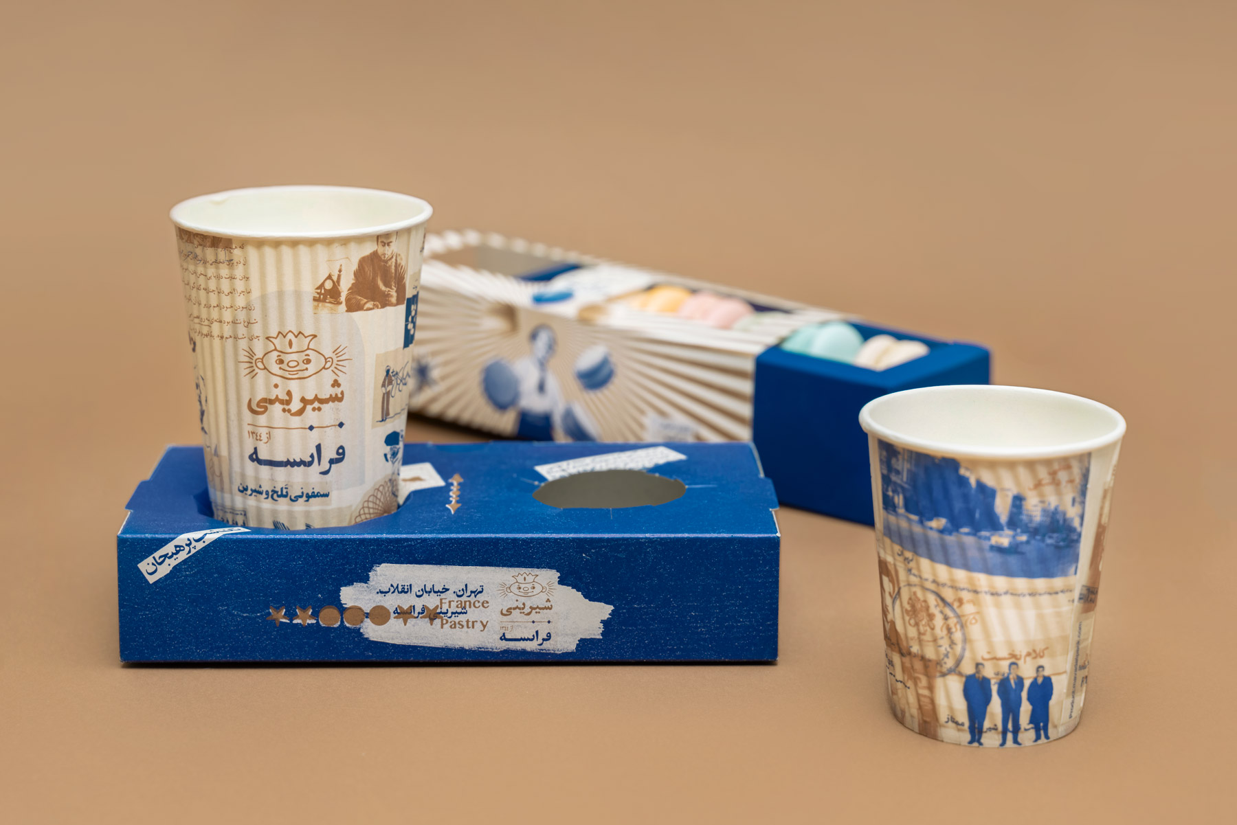
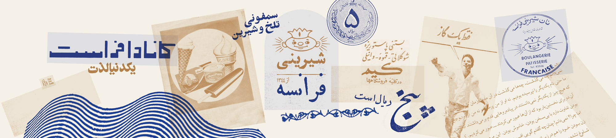
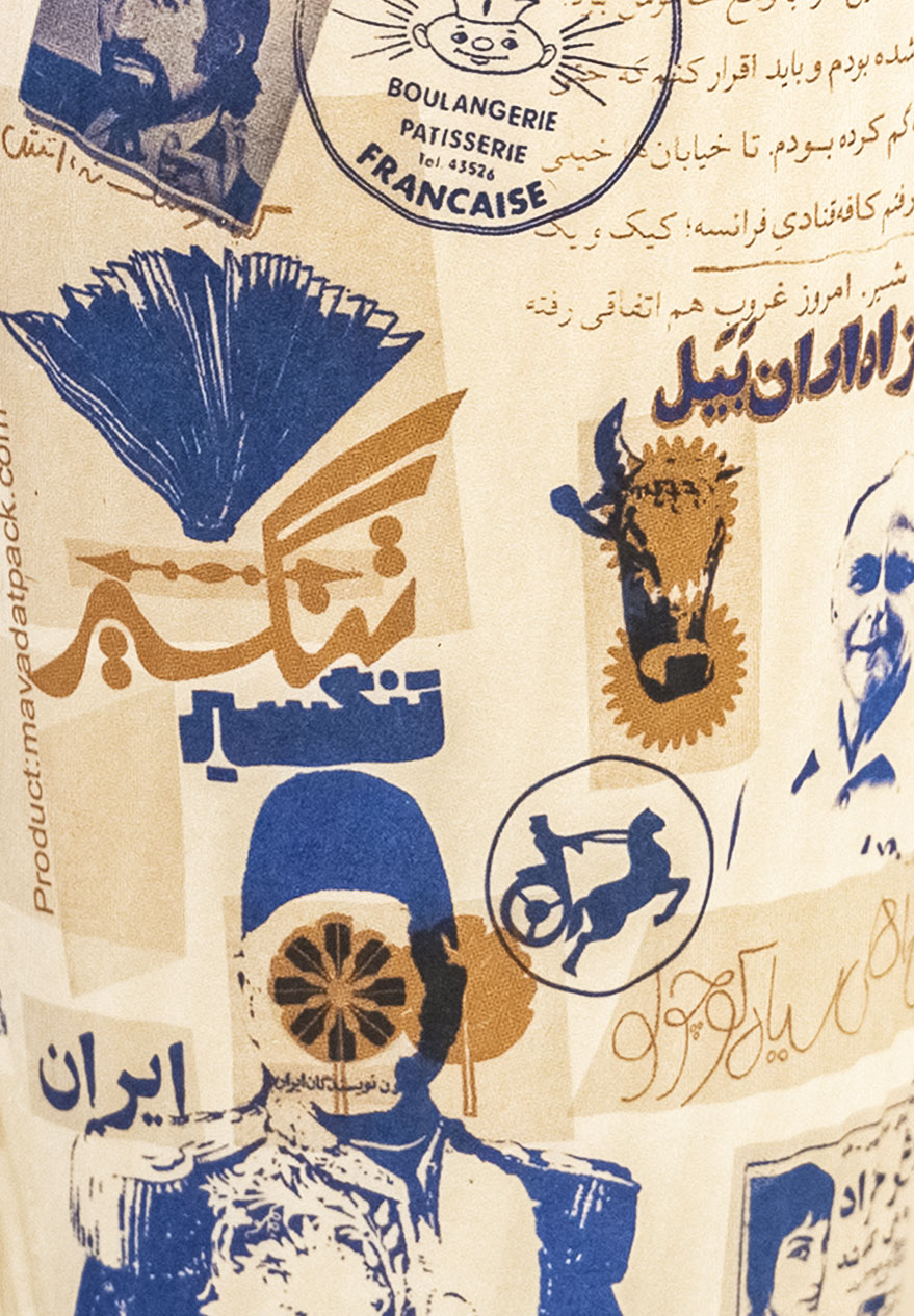
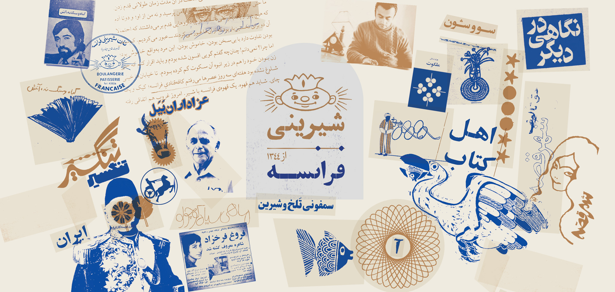
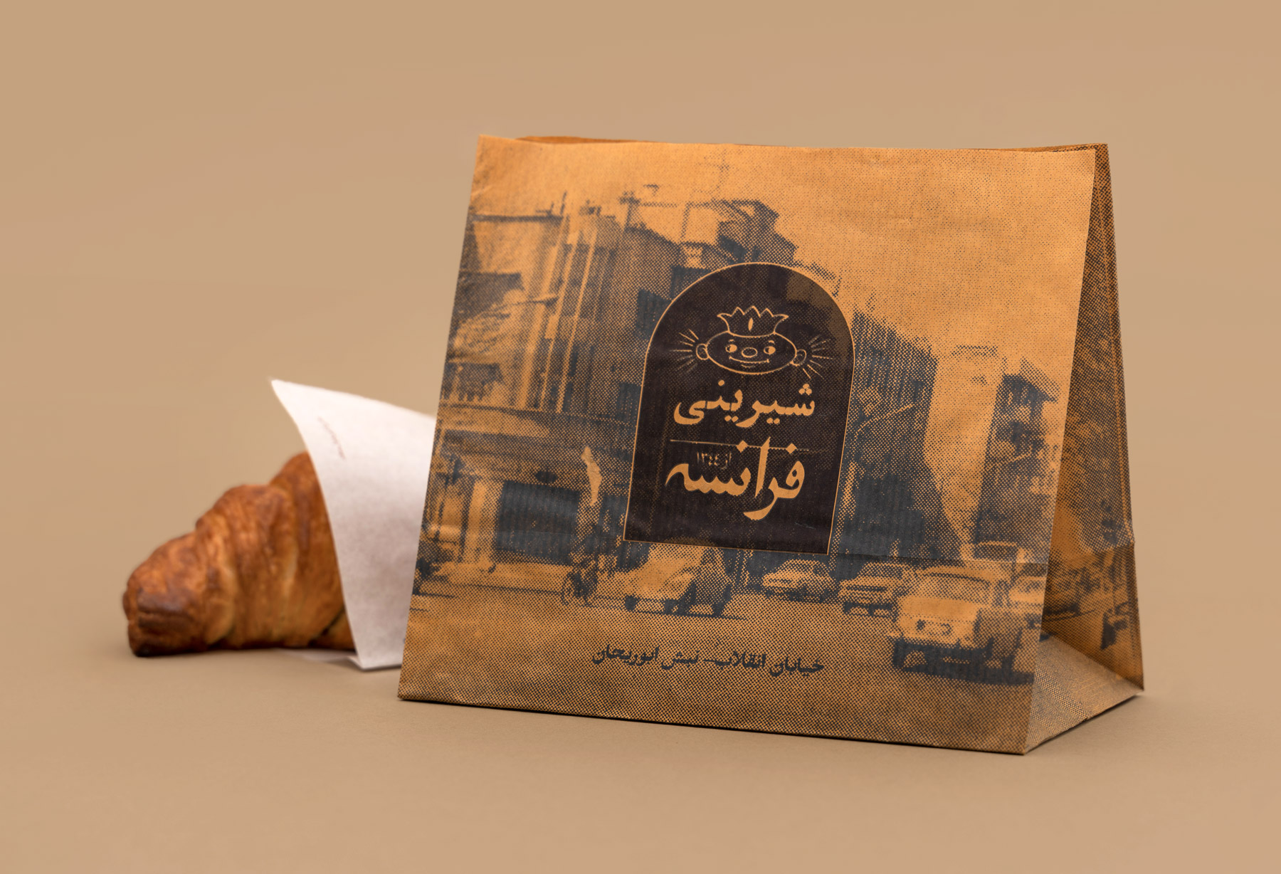
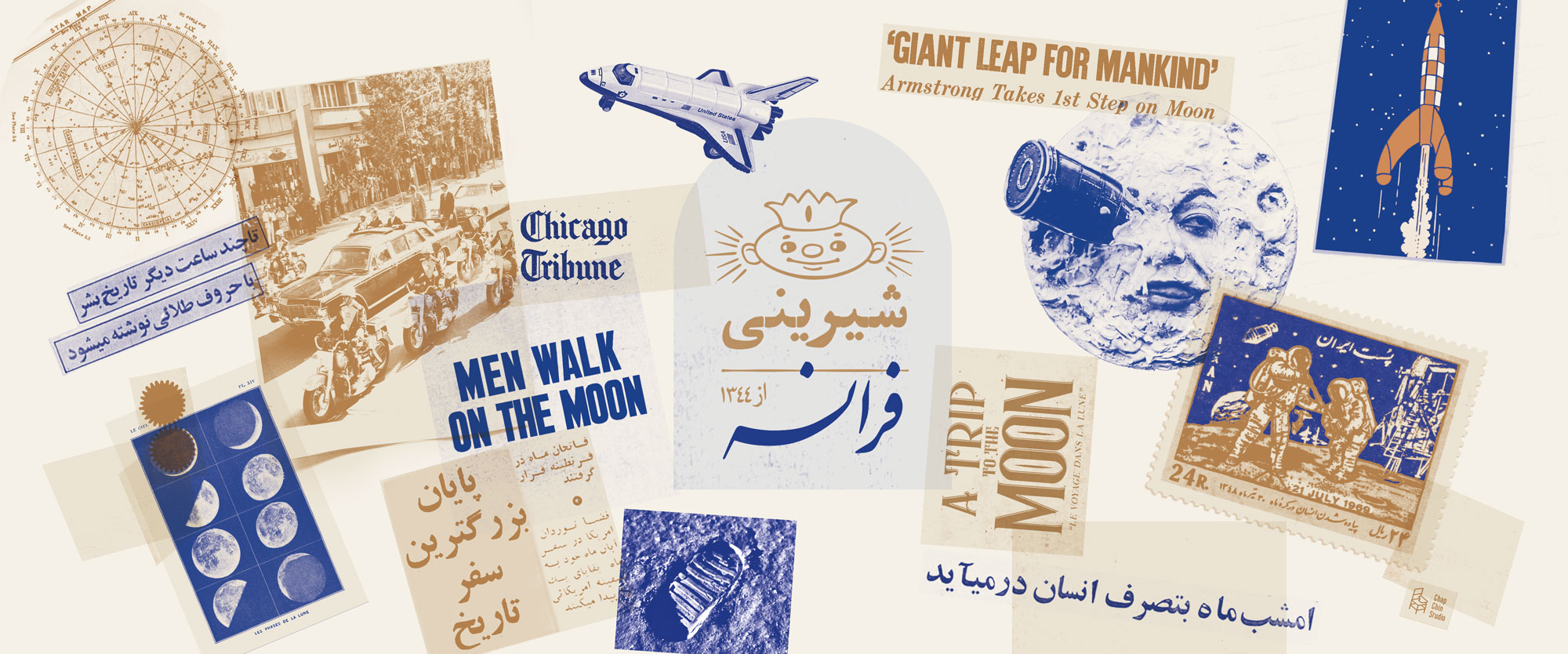
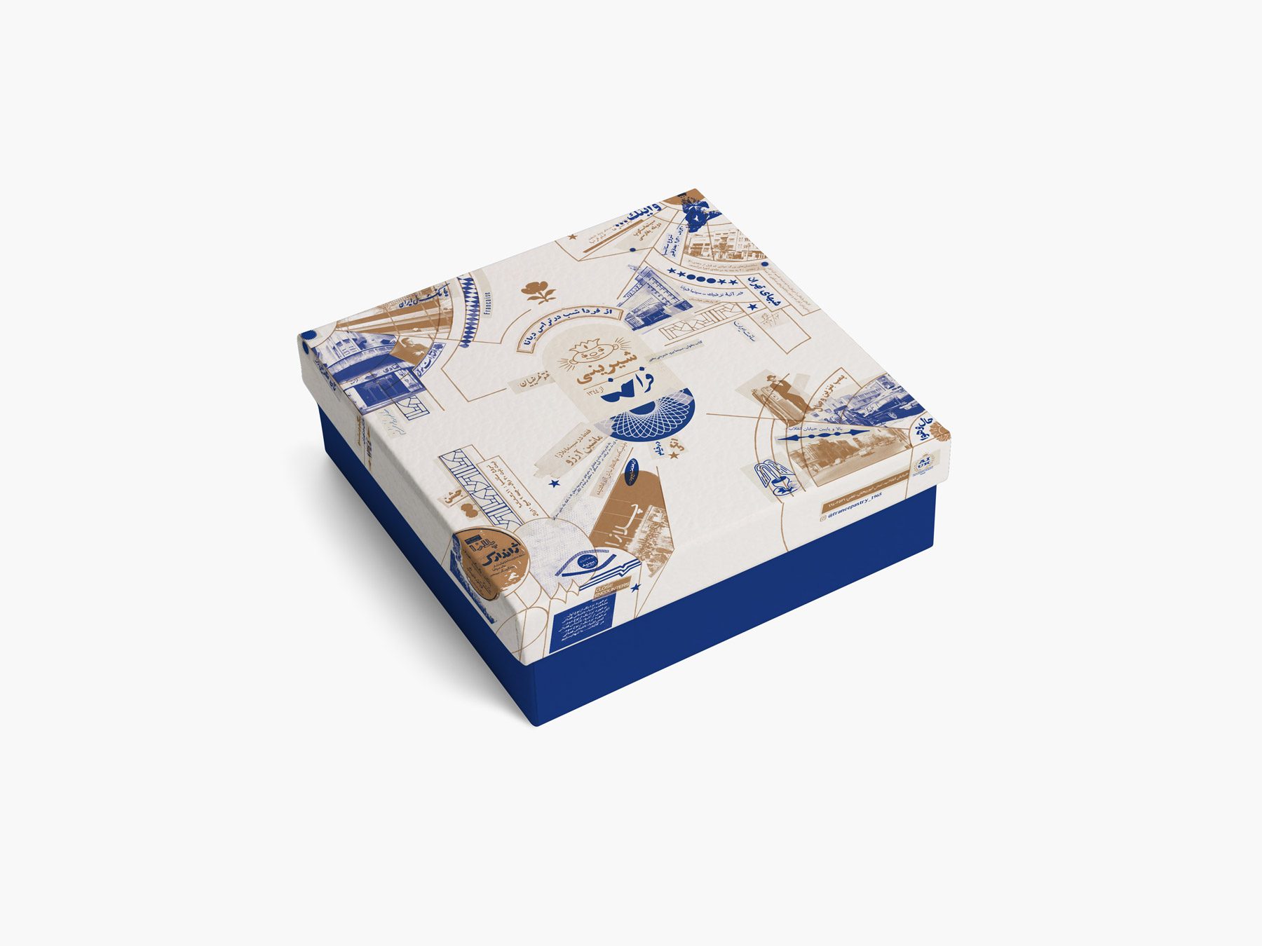
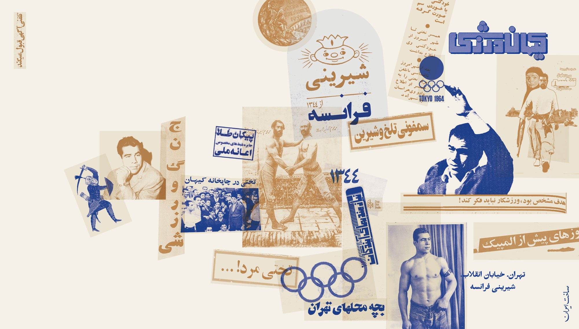
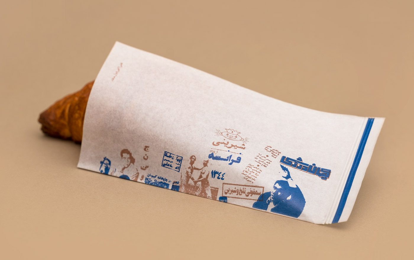
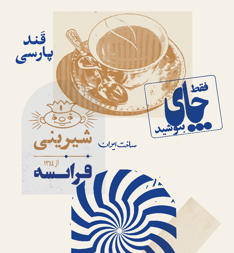
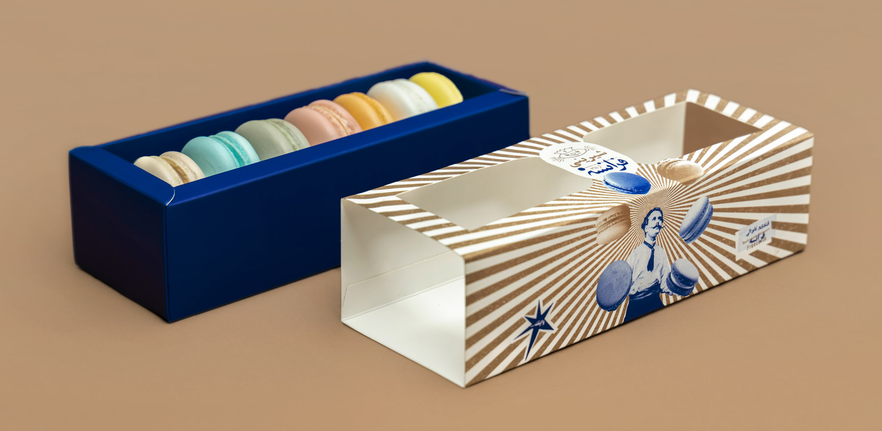
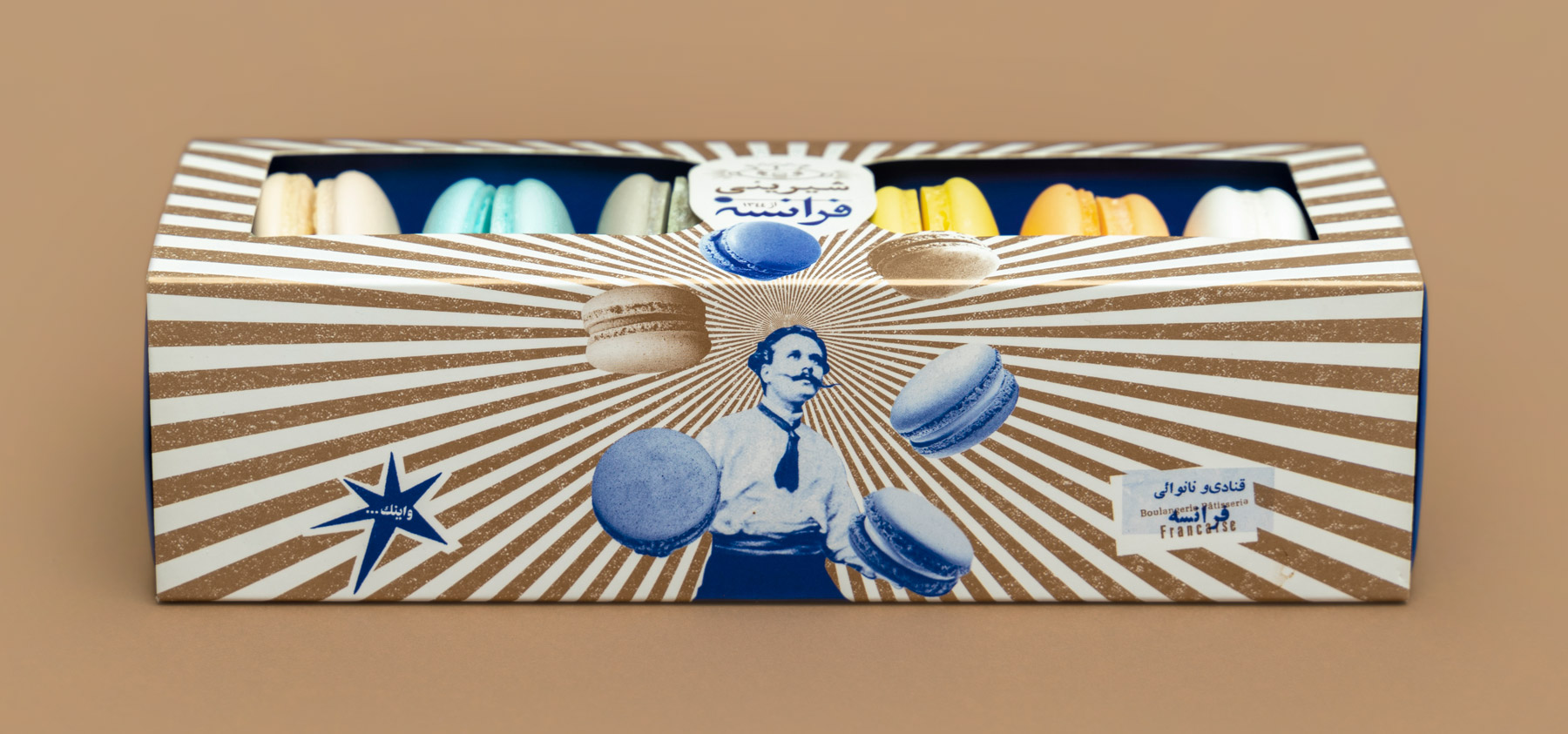
“France” is an old confectionery and coffee shop in the heart of Tehran. Because of the proximity to universities and book stores on Enqelab street, this place has always been a well-known coffee shop for students, intellectuals, artists, and even casual passersby. They often stop there for a moment and enjoy a cup of coffee with a fresh pastry. For decades since the opening of France Confectionery in 1965, it has always been at the center of different cultural and political events in Enqelab street. From the arrival of Neil Armstrong and his crew to Tehran to the 1979 revolution, and to the recent demonstrations in 2008 and 2019 protests, the history of France Confectionery has been merged with the bitter and sweet memories of Tehran.

In those years, the shop sign of France has been continuously changing for different reasons. We thought it is interesting to keep those typographies as part of their history and use them for their new visual identity. We also wanted to create a nostalgic mood for the overall look. We collected a lot of old images and texts from the confectionary itself and the journals of the ’60s and ’70s. After putting them in different categories, we cut them and made many retro-style collages. Based on the central concept, the “bitter and sweet symphony” was added later to the compositions as the new tagline for the famous confectionary.

Client: France Confectionery
Design: Davood Morgan, Javad Zarinia, Shima Pirayesh
Art Direction: Farid Yahaghi
Research Director: Mahmood Torabian
Photography: Adeleh Esmaeili