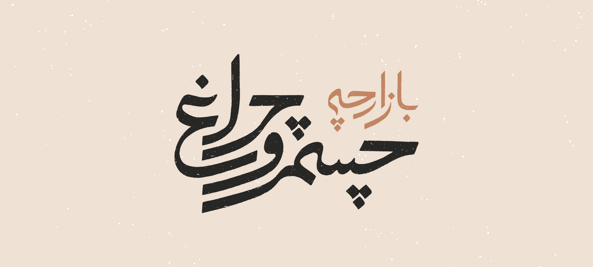
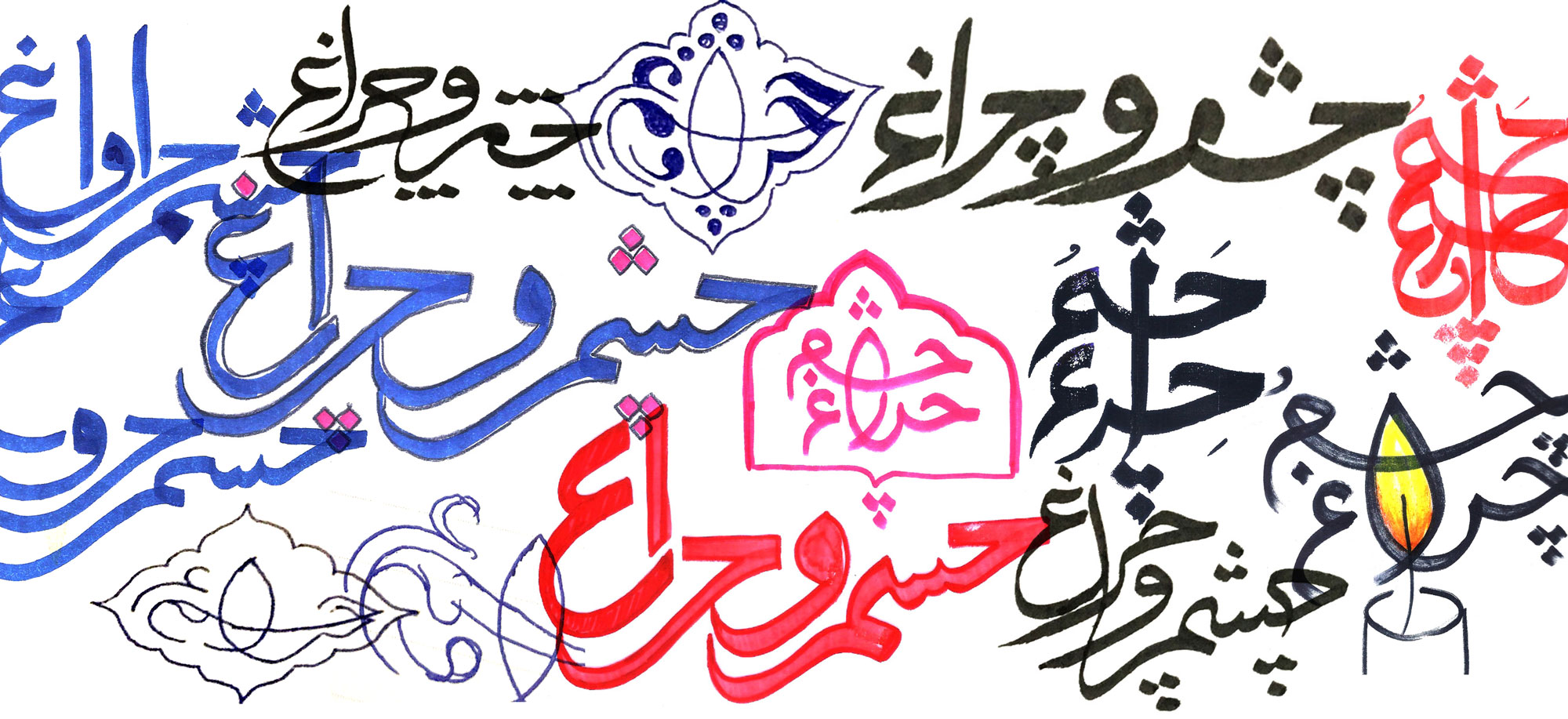
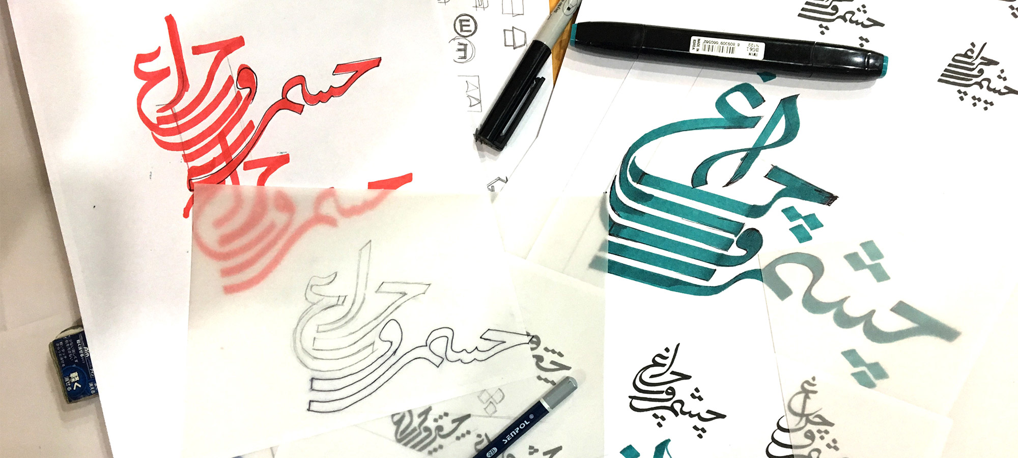
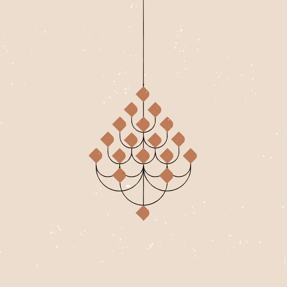
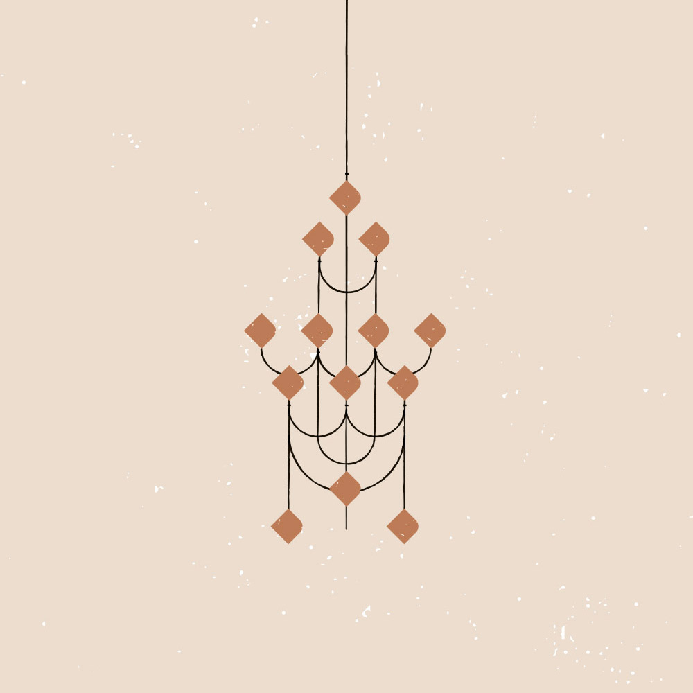
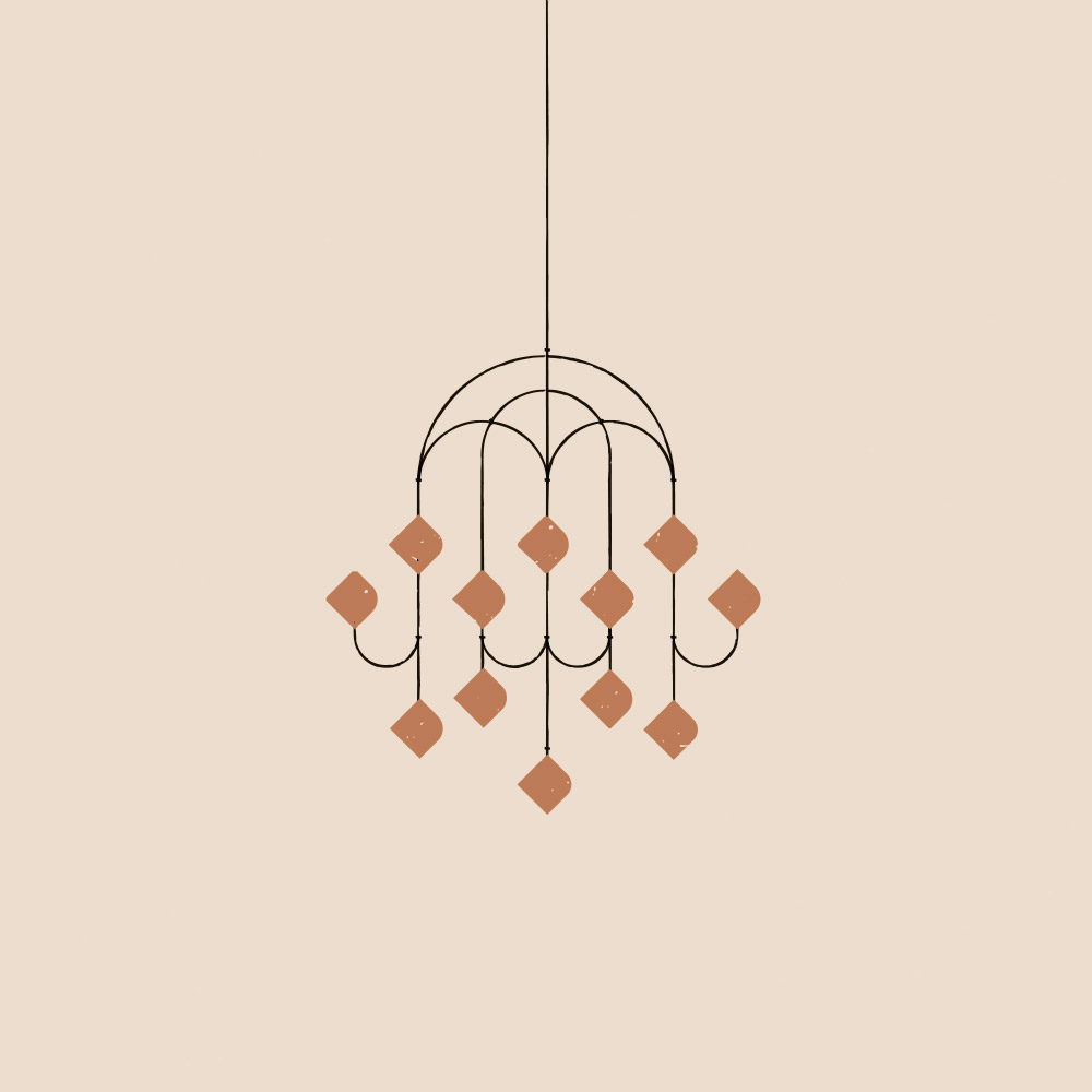
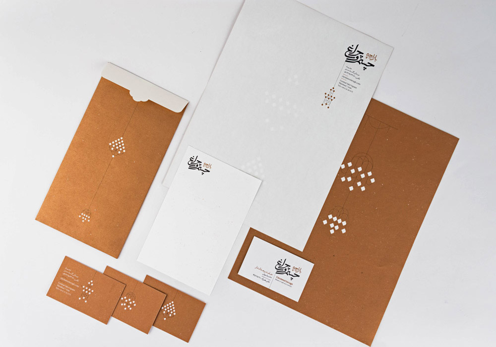
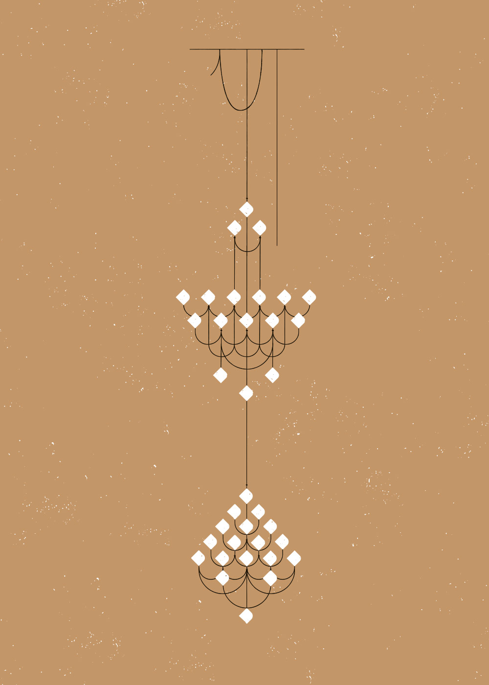
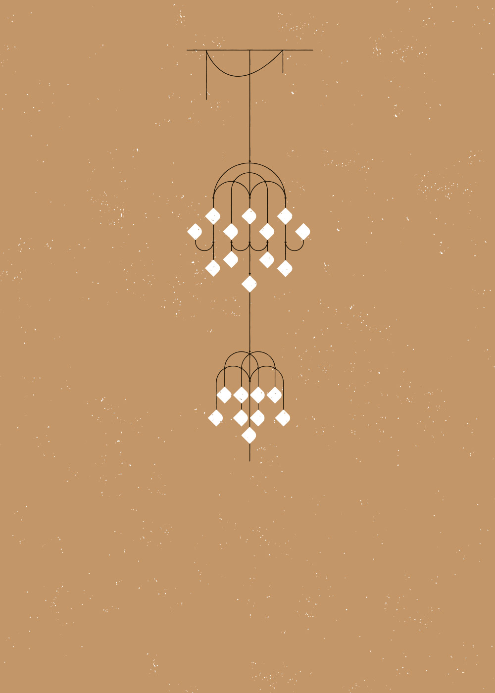
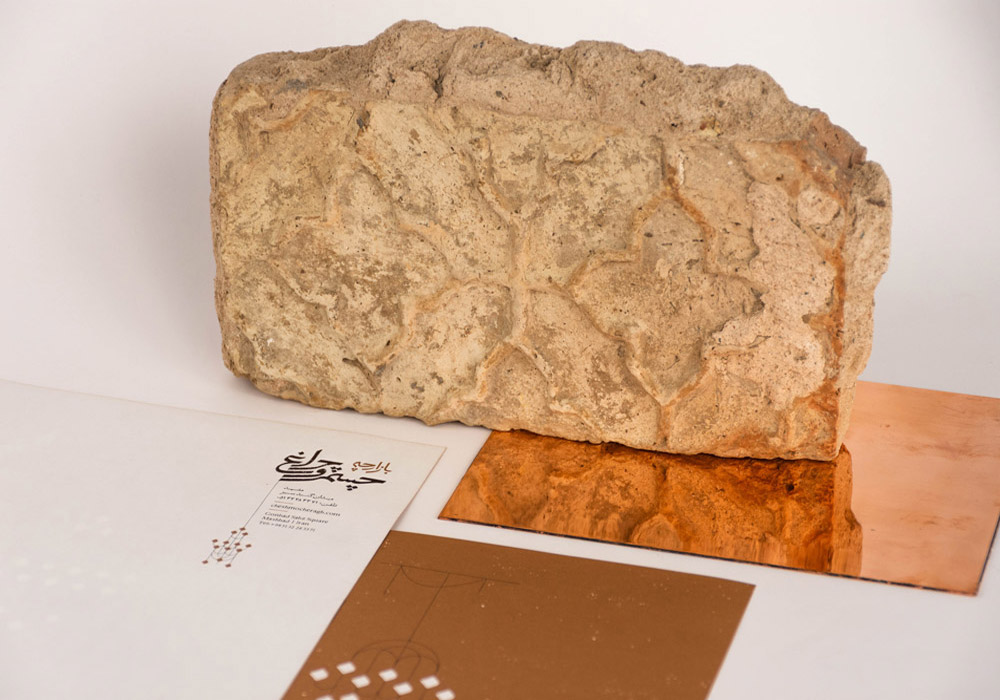
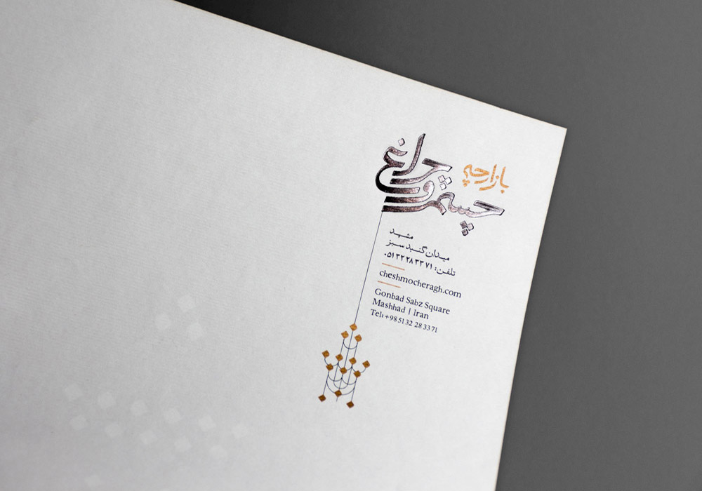
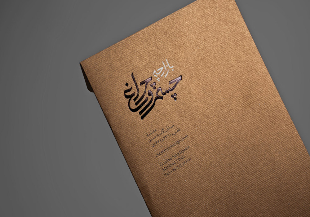
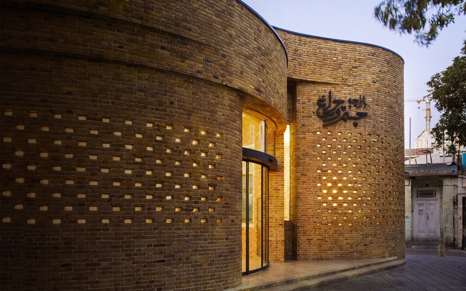
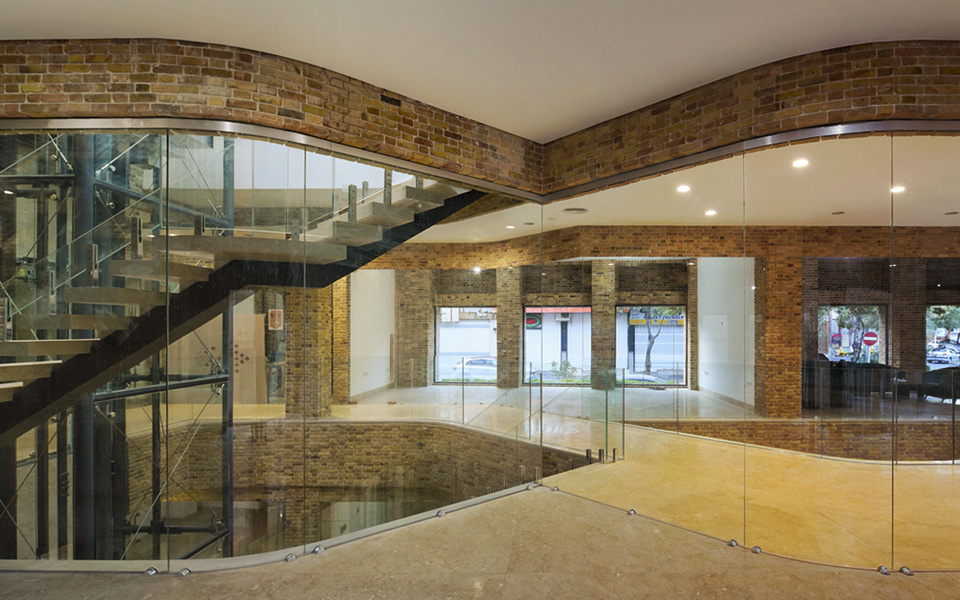
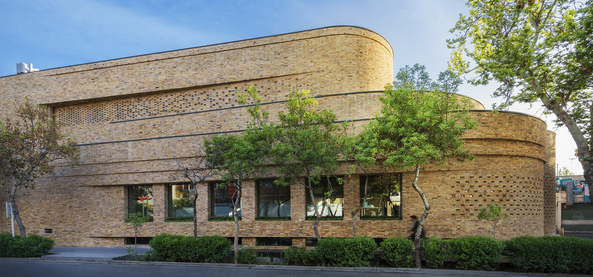
Cheshm-o-Cheraq (eye and light) is a Persian idiom that is metaphorically used to call loved ones. We chose this name for a lighting market complex in the heart of Mashhad. The modern but at the same time traditional Iranian architecture of their building inspired us to follow the same approach through the brand’s visual identity design process. The logotype was designed from the elements that we borrowed from Persian calligraphy. We also created a variety of illustrated chandeliers with lines and calligraphic dots. The copper color was chosen as the brand’s primary color to support the cultural yet modern character of the architecture.Read moreRelated project